
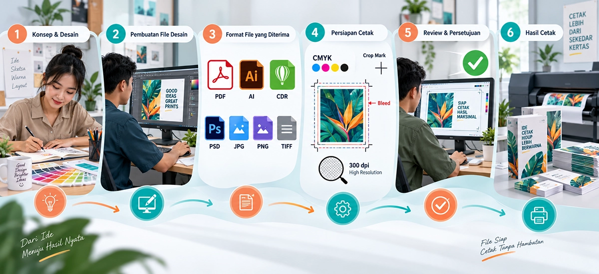
Design Preparation Guidelines for Maximum Print Results
To ensure your design is printed perfectly, sharp, and exactly as you envisioned, there are several technical rules you must follow before submitting your files (artwork) to Bali Print Shop. Incorrect file settings can lead to mismatched colors, pixelated images, or trimmed text.
1. Actual Size and Print Scale (1:1)
The most basic yet frequently overlooked rule is ensuring your file size matches the physical print size. Make sure you set your canvas or artboard size in your design software (such as Adobe Illustrator, CorelDraw, or Photoshop) exactly to the final print size you want (1:1 Scale). Example: If you are ordering an A4 brochure (21 x 29.7 cm), ensure your design file is exactly 21 x 29.7 cm (excluding Bleed). Forcibly enlarging a small-scale design for printing will result in a blurry or pixelated outcome.
2. Quality, Design Sharpness, and Resolution (DPI)
File resolution determines the crispness of your final print. Resolution is measured in DPI (Dots Per Inch) or PPI (Pixels Per Inch).
-
For Standard Prints (Brochures, Business Cards, Books, Flyers) :
Use a minimum resolution of 300 dpi. This ensures small text and fine image details remain incredibly sharp when read from up close. -
For Large Format (Banners, Billboards, Backdrops) :
Since these are viewed from a distance, a resolution of 150 dpi to 200 dpi at a 1:1 scale is more than sufficient and will keep your file size manageable.
File Format Choices Based on Product :
-
Text-Intensive Products (Books, Magazines, Catalogs) :
We highly recommend submitting files in PDF format. Ensure all text and fonts are Converted to Curves or Create Outlines so the fonts do not change (missing fonts) when opened in our system. -
Large Format Products (Banners, Posters) :
You can use PDF, TIFF, or High-Resolution JPEG. Ensure no loose layers are left and Flatten Image before saving.
3. Color Conversion : Screen (RGB) vs. Printer (CMYK)
Your monitor screen displays colors using light (RGB: Red, Green, Blue), which can produce bright and neon colors. However, printing machines use physical ink (CMYK: Cyan, Magenta, Yellow, Key/Black).
Mandatory Rule :
You must convert your document's color mode from RGB to CMYK before you start designing. If you submit an RGB file, our printing machines will automatically convert it to CMYK, which often results in a loss of color brightness (colors become darker or muddy).
Specific Color Settings Guide (Black, Blue, and Purple)
In CMYK mode, the percentage mixture of inks heavily influences the final result. Here is how to set critical colors correctly:
Pure Black
CMYK Formula :
C=0, M=0, Y=0, K=100
When to use it?
Use Pure Black strictly for text/typography (especially below 15pt), thin lines, and Barcodes/QR Codes. If you mix other inks for small text, the risk of misregistration (the print plates shifting by a fraction of a millimeter) will cause the edges of the text to look blurry or have a shadow effect.
Rich Black
CMYK Formula :
C=60, M=40, Y=40, K=100
When to use it?
Use Rich Black for large solid background areas. If you only use K=100 on a large block, the result will look like a washed-out, dark gray. Adding Cyan, Magenta, and Yellow gives the black a deep, solid, and luxurious appearance. (Note: Never use Rich Black for small text!)
Blue
In printing, blue can easily shift to purple if the Magenta value is too high.
Safe Rule :
Ensure the Cyan (C) value is at least 30% higher than Magenta (M). A good blue setting example : C=100, M=60, Y=0, K=0.
Purple
To achieve a vibrant purple that doesn't look muddy, avoid using Yellow (Y) or Black (K) inks entirely.
Use a dominant combination of Magenta and Cyan. Example : C=60, M=100, Y=0, K=0.
4. Bleed, Safe Area, and Crop Marks
Industrial paper cutting machines slice through hundreds of sheets at once, so a slight cutting shift tolerance (around 1-2 mm) is completely normal. To accommodate this, your file must have:
-
Bleed : An extra area extending beyond the final trim size (usually an additional 3-5 mm on each side). This ensures that if the cutter blade shifts slightly, there won't be any unprinted white edges. Make sure your background color or image extends all the way to the edge of the Bleed area.
-
Safe Area : Leave a safe margin of at least 5-8 mm inside the cutting line. Do not place any important text, logos, or information past this boundary to prevent them from being accidentally trimmed.
-
Crop Marks : Guideline marks placed at the outer corners of the design to tell the operator exactly where the blade should cut. You can automatically add these when exporting to PDF.
5. Specific Margin Settings for Books
For book printing (Hardcover, Softcover, Magazines), margins are not just about aesthetics; they serve a technical binding function.
-
Binding Space (Gutter/Inner Margin) :
When a book is bound using hot glue (perfect binding) or saddle stitching, a portion of the inner center area is "swallowed" by the binding fold. -
Mandatory Rule :
Leave a minimum margin of 2 cm (20 mm) on every edge of the page, especially on the inside margin (gutter). If the margin is too narrow, text near the center will curve inward, get caught in the glue, and become very difficult to read without forcing the book flat and potentially breaking the spine.
6. The Risks of Using Edge Borders
(Highly Vital!)
Many designers love the look of borders or frames (like a white or colored line) outlining the outer edge of a design (common in business cards, certificates, or invitations). We strongly advise against using thin edge borders.
Why is this a problem?
As explained earlier, guillotine cutting machines cut large stacks of paper, and the pressure causes slight shifting (a tolerance of 1 to 2 mm). If you use a 3 mm border and the blade shifts just 1 mm, the final result will have a 2 mm border on one side and a 4 mm border on the opposite side. This variance makes the design look visibly lopsided, asymmetrical, and highly unprofessional.
The Solution :
If you absolutely must use a framed design, ensure the border is very thick (the distance from the border edge to the trim line should be a minimum of 6 mm to 7 mm). With a thick border, a 1 mm cutting shift will not be noticeable to the naked eye. However, the safest and most reliable option is always to use a full bleed design (edge-to-edge graphics without a border).